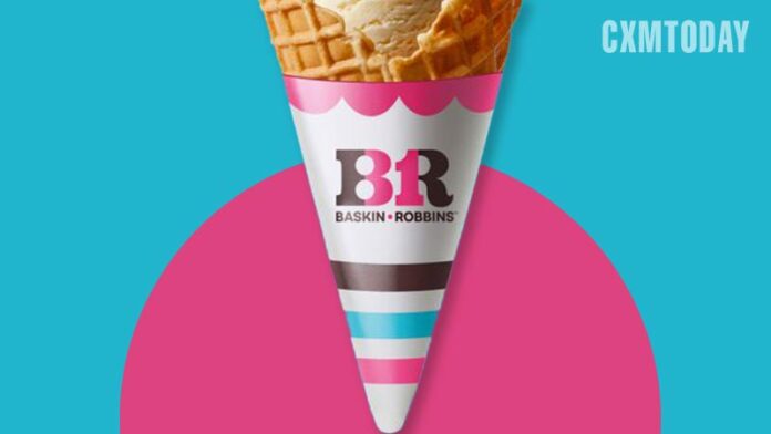
Baskin-Robbins joins a growing list of brands freshening up logos and taglines so far this year. The 77-year-old ice cream purveyor, known for its “31 flavors” tagline, is shaking up its identity to focus on celebrating life’s small moments, seemingly shifting to a more consumer storytelling approach rather than emphasizing its flavor count.
The number 31 remains a key part of the chain’s packaging, with the number hidden amongst the “BR” logo that now sports cleaner lines and a less busy typeface.
Its fresh look and tagline aim to acknowledge the role ice cream plays in consumers’ lives while still highlighting Baskin-Robbins’ legacy of tying in the “31” element.
“Small moments that spark joy often get taken for granted. We’re encouraging people to pause and celebrate any moment that brings happiness with Baskin-Robbins,” Jerid Grandinetti, the chain’s vice president of marketing and culinary, said in the announcement.
The ice cream chain’s updated look follows refreshes by legacy brands including M&M’s, Coca-Cola and Anheuser-Busch earlier this year. Each used different tactics to highlight their respective marketing priorities, but all appear to be using their brand makeover to better fit a landscape repeatedly altered by the pandemic and charge ahead with a simplified, realigned message.


